PROJECT OVERVIEW
Microsoft REEL
2019
During the summer of 2019, I had the pleasure of interning as a UX design intern at Microsoft through the Garage program in Cambridge, Massachusetts. Throughout my time there I was able to design a mobile application focused on demonstrating Azure AI and ML capabilities.
Our project name is R.E.E.L., which stands for Recommendation Engine Example Layout. R.E.E.L. is a movie recommendation application that demonstrates the usage of the many recommendation algorithms Microsoft has. This project uses a visually compelling solution in order to easily demonstrate the output of these algorithms for Microsoft customers. The application, R.E.E.L. was built/coded using Microsoft Xamarin forms.
The Problem
So where do you begin? Our first task was identifying the purpose of our the application. The current system in place for the AI CAT team at Microsoft involves showing forms of code to demonstrate different algorithms and the varying results they can produce. So what’s the problem with that? Great question!
The problem with the existing solution was that the entirety of their target audience is not highly versed in software engineering terminology and outputs. So that’s where I come in to play. As a team we set out to create a visual solution to effectively articulate an algorithm’s output.
Identifying the User
Identifying who would be using our product. REEL would be used to demonstrate Microsoft Recommendations to clients (both technical and non-technical), along with being accessible on the Recommenders Github repository for open source usage.
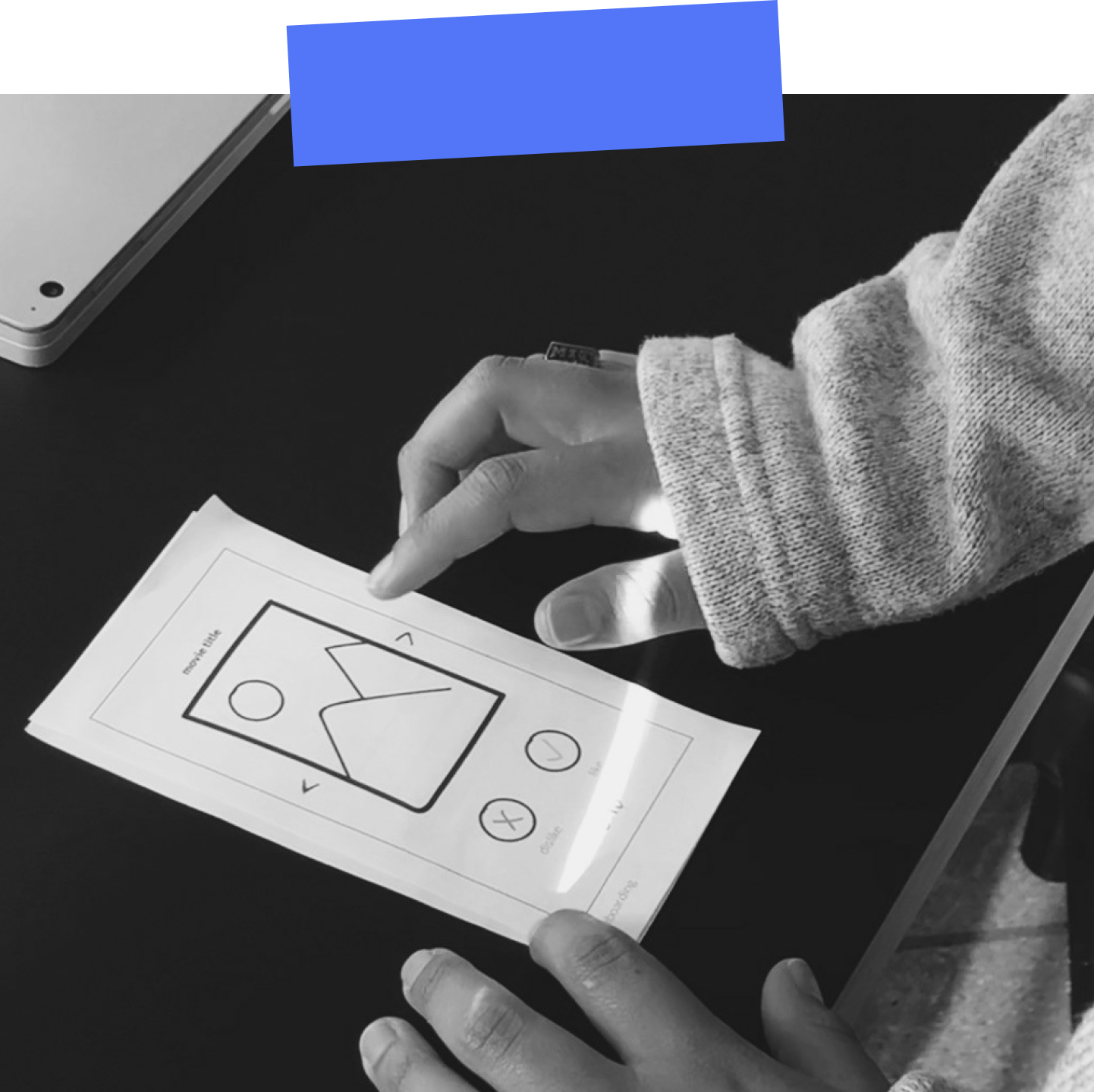
Once this was determined, I was able to develop a general user flow for the application to follow. The flow was then used to develop paper prototypes for user testing to find any inconsistencies.
Business Professional
Non-Technical, business focused professional with no prior background working with code
Open Source Developer
Seeking open source resources to develop programs for personal use and practicing the use of algorithms
Data Scientist
Strong familiarity with code and other background information needed to understand the complexity of algorithms
Research & Prototyping
After developing our concept fully with our team, I decided to move on to research. This included paper prototyping research which involved creating user flows to begin, then designing the paper wireframes, cutting them out and testing them with various interns and other potential users.
Since REEL is an internal product, it was difficult to find any existing applications with similar offerings. For example, Amazon Web Services and Google Cloud Services were both evaluated for competitive analysis but unfortunately were not helpful in aiding our analysis process.

Once our team got further into the process of both development and design, we started to put more emphasis on the overall look and feel of the UI and Visual design of REEL. I developed two separate moodboards, one light mode and the other dark mode. After asking my team which they preferred, we all came to agree on the dark mode style.
Typeface
Montserrat
Color Palette

Onboarding with Animation
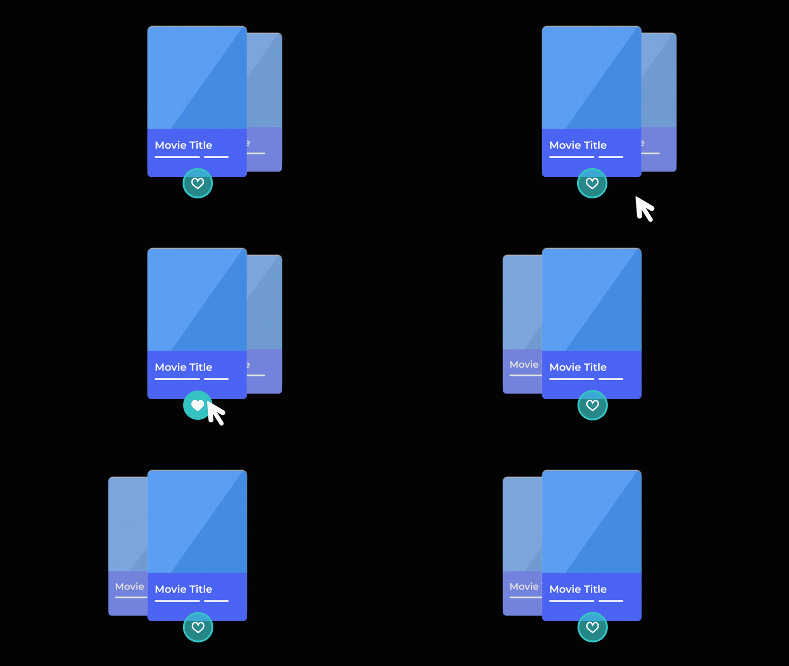
Into the development process, it was determined that on-boarding was a necessary step in informing the user about the goal of the application and how to proceed. These animations accompany the on-boarding process to provide visual aid/instructions.

Quick Walkthrough
This is a video walkthrough of the design assets I created using Figma demonstrating how the REEL on-boarding works within the application.
Once the user completes this process it takes them to the home page where it shows recommended movies based on their input. For switching between algorithms, the settings page lists the twelve different algorithms to change between.
*For the duration of the summer (about 12 weeks), our team was only able to program and train 2 of the 12 total algorithms.
THAT'S A WRAP
Final Takeaways
- Try to narrow down your scope sooner rather than later
- User Testing with your product provides you with an outside perspective on your product's progress and helps to improve any flaws you may not have noticed
- Strong communication with your team & developers goes a long way when creating a product
- Focus on the MVP (minimum viable product) as your end result before focusing on stretch goal features/additions
Extra Extra read all about it & Feel free to take a look at our output deck.
Looking for the github? find that here.
Selected Works
